Your website gets visits but no enquiries. Here's where it usually goes wrong.
If people are landing on your site and not getting in touch, the instinct is to go looking for more visitors. Usually that's the wrong end of the problem.
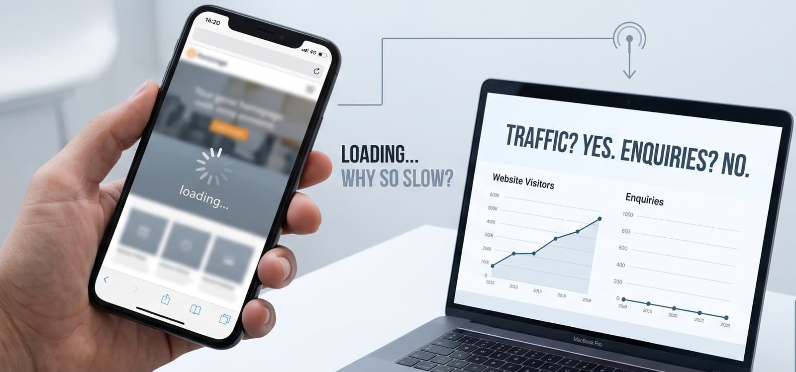
A website that gets traffic and no enquiries is already telling you something useful: people can find you. That's the hard part, and it's done. What's failing is everything after the click — and that's almost always cheaper to fix than buying more visits.
Here's what I'd check, roughly in the order I'd check it.
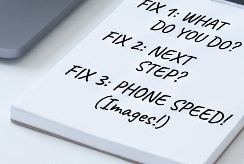
1. The first screen doesn't say what you do
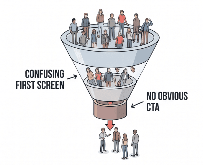
Someone arriving on your homepage is answering one question: am I in the right place? They will decide in a couple of seconds, and they will decide from whatever is visible without scrolling.
A surprising number of business sites fail this. The first screen carries a slogan, a stock photograph and a mood — but not the thing the business actually does, or where it does it. If a stranger can't finish the sentence "this is a ___ in ___" from your first screen, that's the fix, and it's a copy fix rather than a design one.
2. There's no obvious next step
Every page should have one clear thing you want the visitor to do, and it should be visible without hunting. Not four competing buttons. Not a phone number in the footer and nothing else.
The related failure is offering only high-commitment steps. "Book a consultation" asks a lot of someone who found you eight minutes ago. Giving people a smaller step they can take immediately — a question answered, a review, a quote — converts the ones who aren't ready to commit yet, and those are most of them.
3. The site is slow on a phone, on mobile data
Most people will see your site on a phone, often on a patchy connection, often while doing something else. A site that takes six seconds to become useful has lost a meaningful share of them before they've read a word — and you'll never see those people in your enquiry inbox, because there's nothing to see.
Test it honestly: your own phone, mobile data rather than office wifi, cache cleared. Not the version that's already loaded in your browser because you look at it every day.
4. Nothing on the page earns trust
People buying a service from a business they've never heard of are looking for reasons to believe you. Not awards — evidence. Real photographs of real work. A named human being. A specific location. Prices, or at least an honest indication of them.
Vagueness reads as evasion. A page that avoids saying what things cost, who does the work, or where the business is based makes a visitor wonder why — and wondering is the opposite of enquiring.
5. The enquiry form asks too much, too early
A form is a negotiation. Every field is something you're asking for before you've given anything. Fourteen required fields, a mandatory phone number and a CAPTCHA is a lot to ask of someone who wanted to check whether you cover their postcode.
Ask for what you genuinely need to reply, and nothing else. If you need more detail to quote properly, that's a good reason to build a form that adapts — asking a removals customer about volume and access, and a salon about opening hours — rather than one long form that asks everyone everything.
6. Enquiries arrive and nothing happens
This one is worth ruling out before you change anything on the site at all. Submit your own form. Check it arrives. Check it doesn't land in spam, or in an inbox nobody opens, or in a mailbox that quietly filled up two years ago.
It's more common than it should be, and it looks exactly like a conversion problem from the outside.
Where to start
If you only do one thing: open your site on your phone, on mobile data, and time how long it takes before you can read the answer to "what does this business do, and how do I contact them?" If that's more than about five seconds, you've found your first fix.
And if you'd rather someone else looked, that's what the Free Website Review is for — a straight assessment of what's working and what isn't, with no obligation attached.
More from In Practice
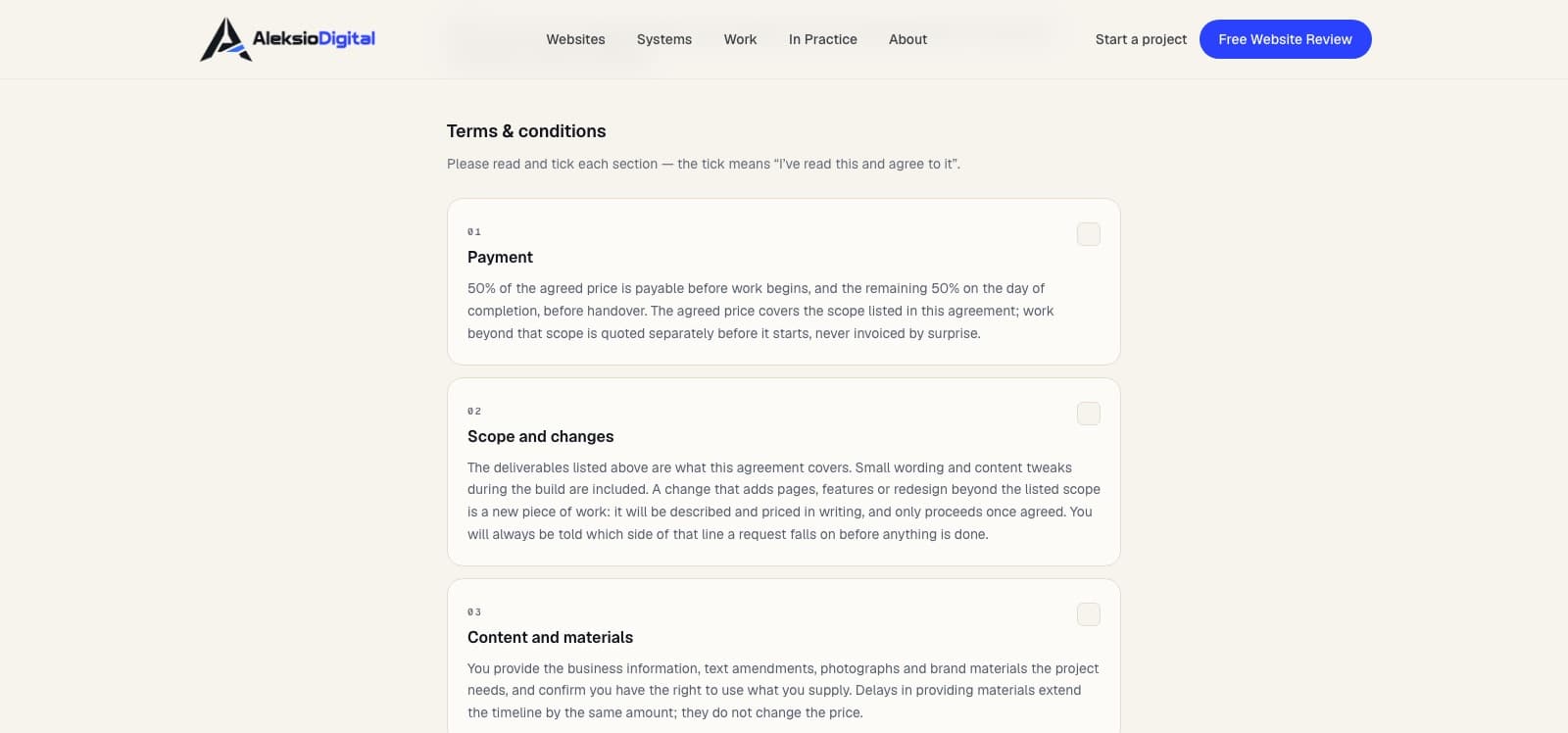
How we sign clients online — and why we built it ourselves.
The proposal-to-deposit system this studio runs on: a link the client ticks and signs on their phone, a branded PDF to both inboxes, the deposit paid by card. What it does, what it deliberately doesn't, and why we didn't just subscribe to DocuSign.
How much does a website cost in Scotland?
Real numbers for what a small-business website costs in Scotland in 2026 — published prices, the costs people forget, and the questions worth asking anyone.
Want this applied to your site?
A Free Website Review is a straight assessment of what’s working, what isn’t, and what to fix first. No obligation.